

Mobile-first: Your website should be designed from the phone
Kurz gesagt
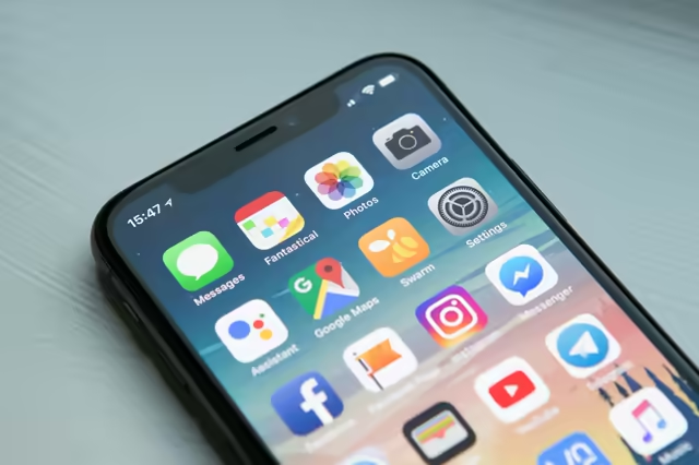
Mobile-first is not optional, it is a must-have in 2026. 80% of traffic from mobile, Google penalizes non-optimized mobile sites.
- Zuerst Problem und Ziel klar benennen.
- Dann einen einfachen Schrittplan skizzieren.
- Jeder Schritt braucht eine feste Verantwortung und einen Termin.
- Ergebnisse messen — ohne Zahlen bleibt es Meinung.
80% of traffic is mobile. Google indexes mobile-first. Your competitors design from the phone. Are you? If your site is "responsive" but not mobile-first – you are losing clients, conversions and Google positions. This is not optional. It is the 2026 standard.
Responsive vs Mobile-First 📱
Responsive is a technique – the site adapts to screen size. Mobile-first is a design approach – you start from the phone, designing UX, layout, content FROM the phone. Desktop is an extension, not the other way around.
💡 Pro tip
Design from 375px width (iPhone SE). Buttons minimum 44x44px. Typography minimum 16px. Lazy load images. Test on real devices, not simulators.
See our web development or contact us for a free quote.
Häufige Fragen
Is responsive enough?
Responsive is the minimum. Mobile-first is a design approach where you design FROM the phone – not from a desktop that you scale down. Difference: mobile-first prioritizes speed, readability, conversion. Responsive often starts from desktop and has to "fit".
Verwandte Artikel
Responsive und Mobile-First – 70% der Kunden besuchen Sie vom Handy
Mobile Traffic-Statistiken, Mobile-First-Indexierung, UX für Smartphones, Geschwindigkeit, Navigation und Tests auf echten Geräten.
Strony WWWCore Web Vitals – Seitengeschwindigkeit, SEO und Verkauf 2026
LCP, INP, CLS – drei Kennzahlen, die Ihr Google-Ranking und die Kundenzufriedenheit bestimmen. Erfahren Sie, wie Sie die Seitengeschwindigkeit verbessern.
Strony WWWLandingpage oder mehrseitige Website – was ist richtig?
Landingpage oder vollständige Website? Vergleichen Sie Vor- und Nachteile, Kosten und Anwendungsfälle für Ihr Unternehmen.
Fragen?
Bei Fragen zu Artikeln oder Lösungen für Ihr Unternehmen. Schreiben Sie mir.
Kontaktieren Sie mich