

Mobile-first: Your website should be designed from the phone
Mobile-first is not optional, it is a must-have in 2026. 80% of traffic from mobile, Google penalizes non-optimized mobile sites.
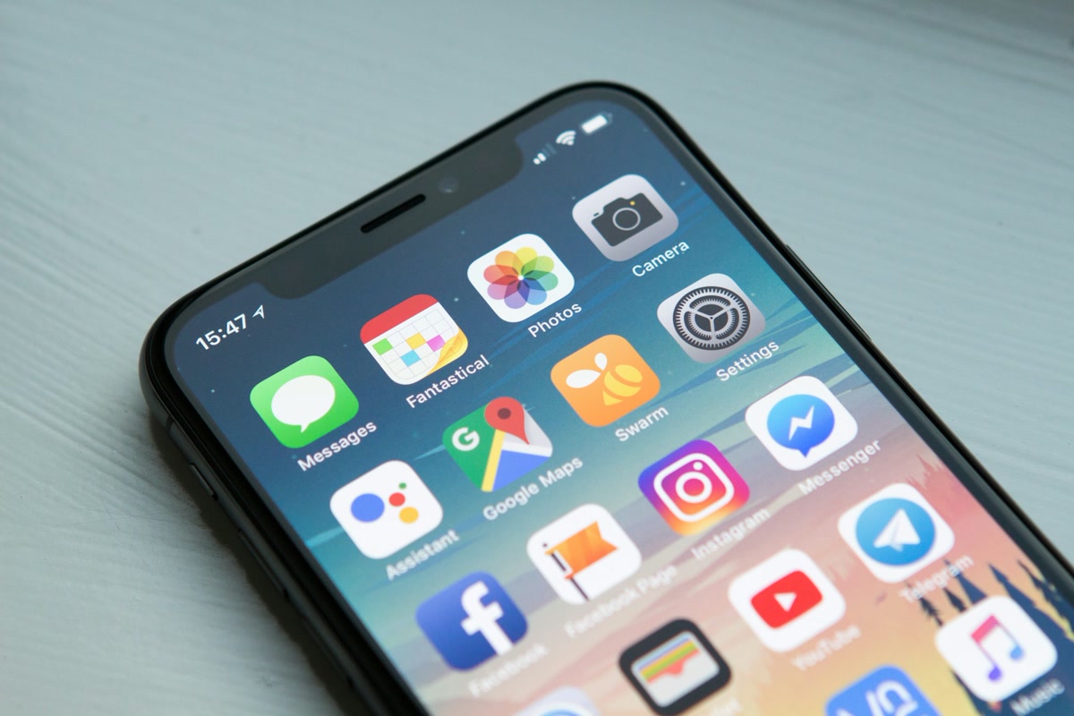
80% of traffic is mobile. Google indexes mobile-first. Your competitors design from the phone. Are you? If your site is "responsive" but not mobile-first – you are losing clients, conversions and Google positions. This is not optional. It is the 2026 standard.
Responsive vs Mobile-First 📱
Responsive is a technique – the site adapts to screen size. Mobile-first is a design approach – you start from the phone, designing UX, layout, content FROM the phone. Desktop is an extension, not the other way around.
💡 Pro tip
Design from 375px width (iPhone SE). Buttons minimum 44x44px. Typography minimum 16px. Lazy load images. Test on real devices, not simulators.
See our web development or contact us for a free quote.
Frequently Asked Questions
- Is responsive enough?
- Responsive is the minimum. Mobile-first is a design approach where you design FROM the phone – not from a desktop that you scale down. Difference: mobile-first prioritizes speed, readability, conversion. Responsive often starts from desktop and has to "fit".

Michał Grycz
Software engineer and founder of MGSupport. Designs and builds high-performance web systems, e-commerce, and business automations.