Neobrutalism in B2B. Distinctive design for stronger positioning.
In short
Distinctive design is not decoration. It helps teams communicate value faster, reduce price pressure, and improve lead quality.
- First name the problem and the goal.
- Then outline a simple step-by-step plan.
- Each step needs an owner and a deadline.
- Track results — without numbers it stays opinion.
Many B2B sites look the same. Same colors. Same stock art. That pushes you into price fights.
Design language that signals authority
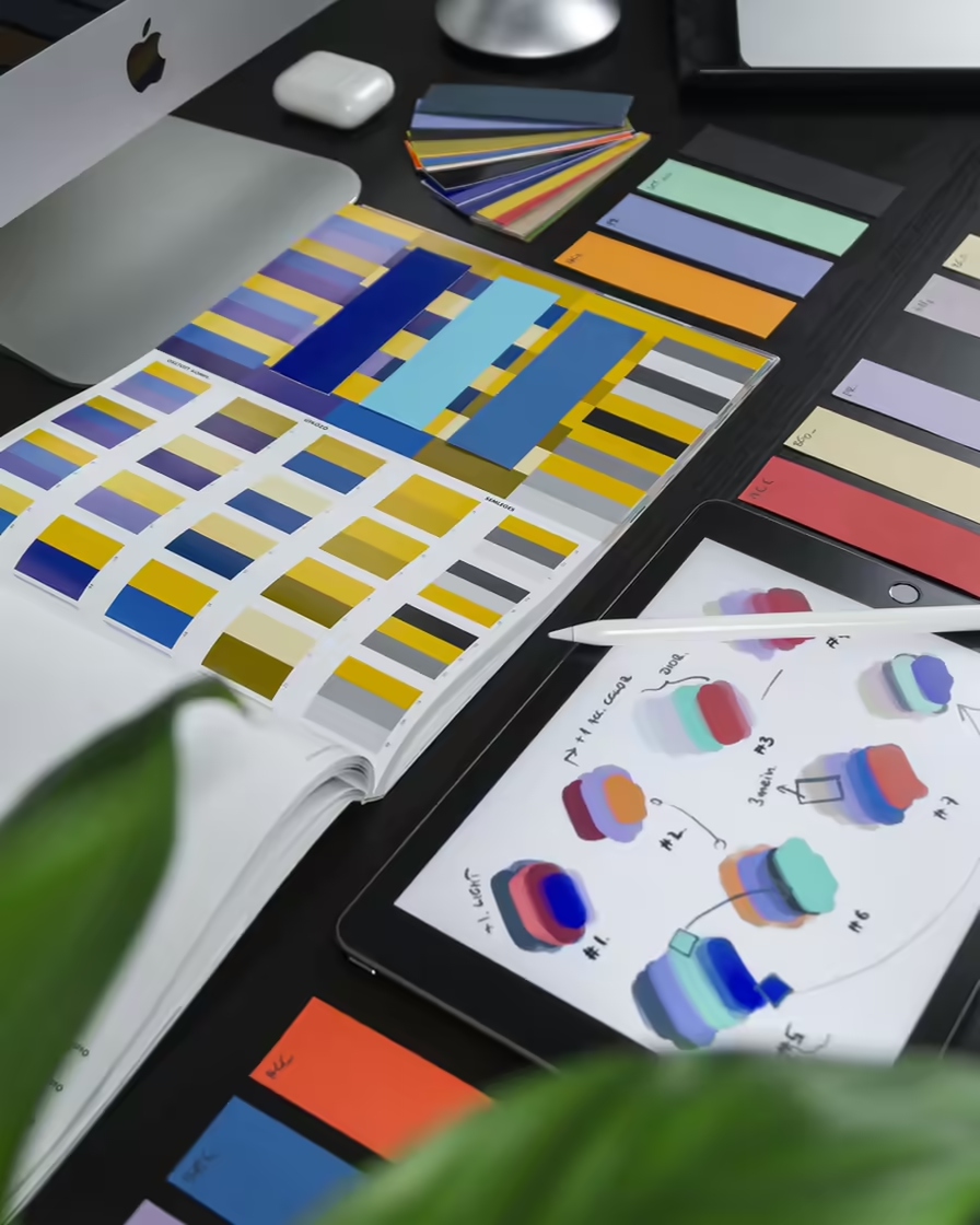
Bold type, strong contrast, clear spacing. Users see who you are in seconds. This is brand signal, not fluff.
Consistent bold design helps campaigns and sales talks. People remember you. They link the look to trust.
How to implement bold design without losing clarity
Define who you are and who you serve. Then set rules for type size, contrast, and layout.
Bold stays consistent on site, landings, and sales PDFs.
After launch, watch time on page, CTA clicks, lead quality, speed to deal. Keep what helps. Drop noise.
- Distinctive visual system built for B2B differentiation.
- Stronger first impression for premium-value perception.
- Consistent design logic across site and sales materials.
- KPI-led iteration to balance boldness and conversion clarity.
FAQ
What is Neobrutalism?
A design trend drawing from brutalist architecture. Raw colors, hard shadows, giant, aggressive typography.
Have questions?
If you have questions about articles or need solutions for your business.
Contact Me